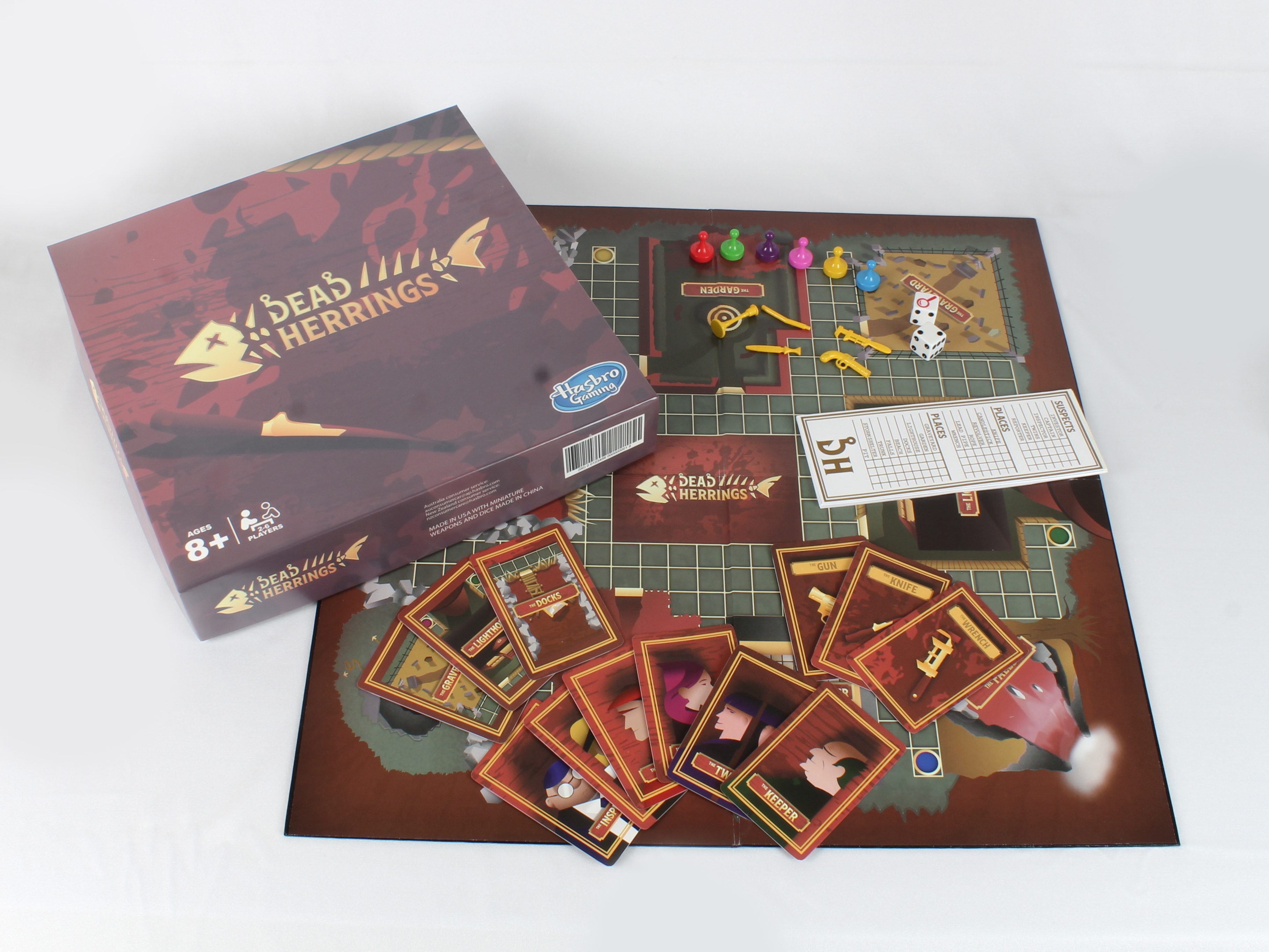
Dead Herrings- Board Game
Branding, Print, Production
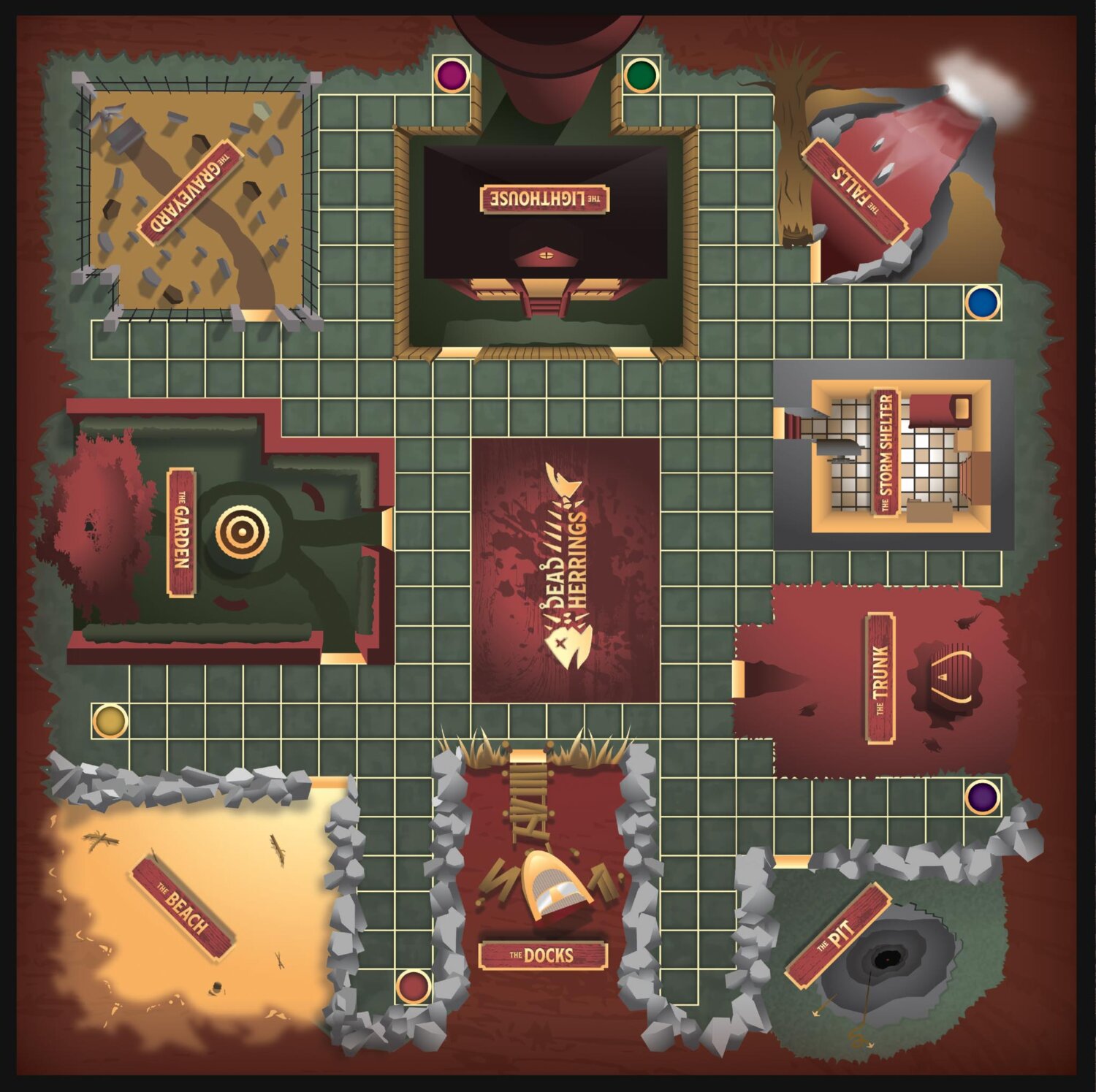
On a small island in the middle of the Baltic Sea, a light house with a dark, mysterious history and a foreboding atmosphere rests.
Legends from the local mainland fishing village tell tales of an island where no fish can be caught and where sailors go to die. This hasn’t stopped curious eyes from gazing towards it.
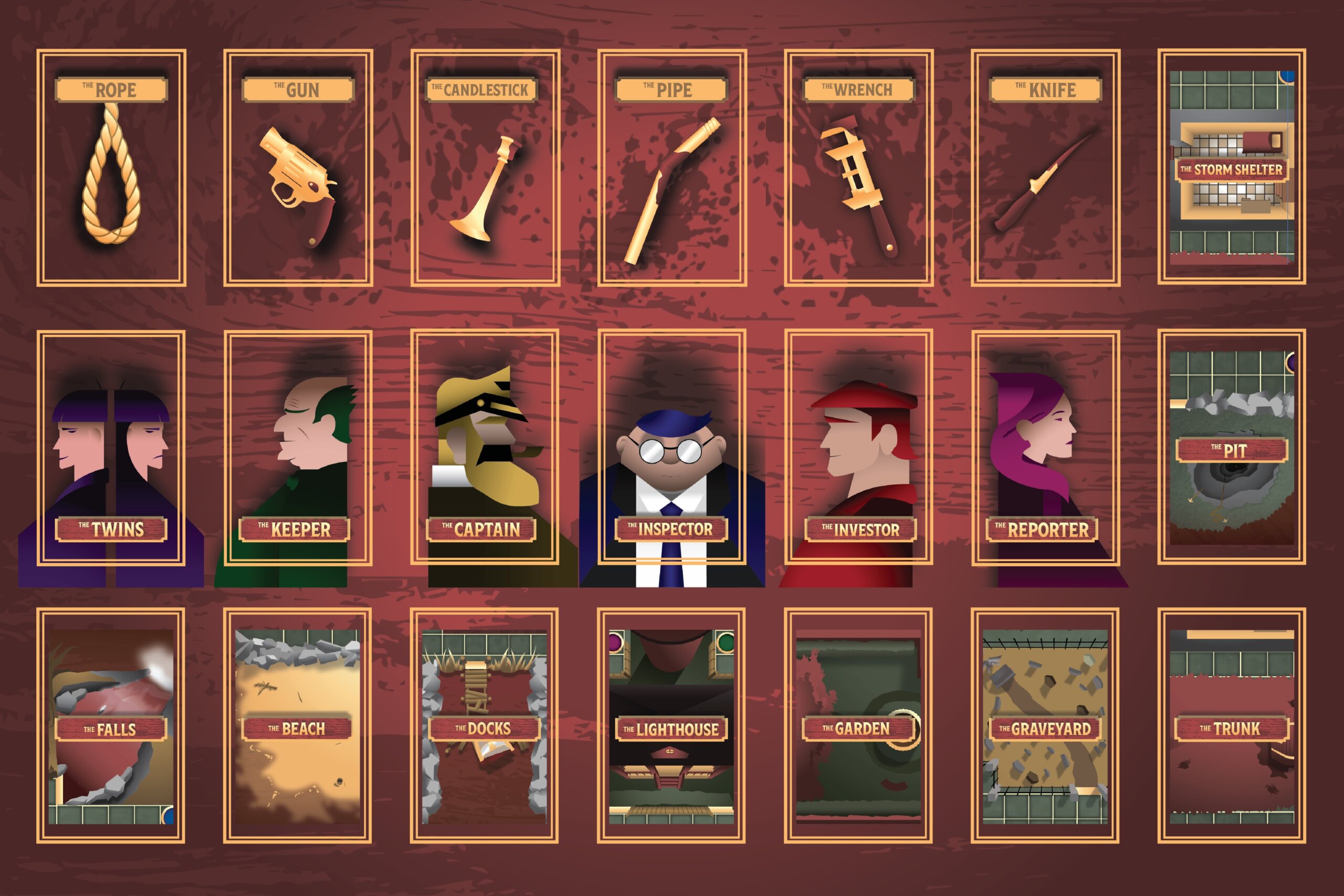
As six visitors become trapped on the island with no way to return to the mainland until the next ferry, they must discover who has been picking them off one by one before all of them become Dead Herrings themselves.
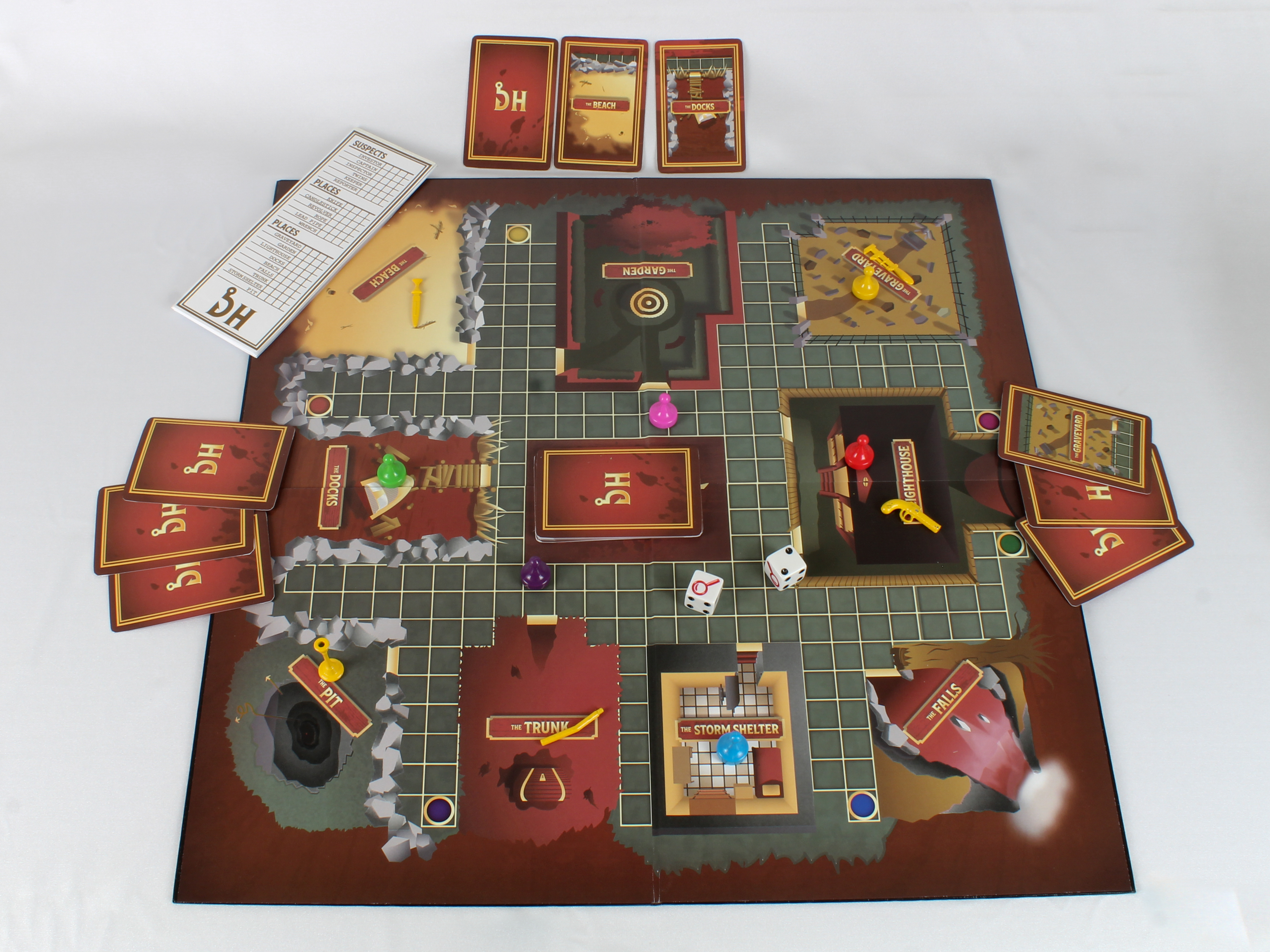
For this project, I illustrated and designed a board game using the rules and play style of one of my favorite board games. “CLUE”. I love mysteries, puzzles, games, the atmosphere of MuRdEr! *Cough*.
I loved reading books as a kid like “Sherlock Holmes”, “And Then There Were None”, and tons of the old school Batman Detective Comics stories from the 70’s and 80’s, so choosing CLUE only made sense.
Modern cinema, such as “Knives Out” was also a source of inspiration for this board game. Especially the sound track.
I also used my childhood for inspiration. Growing up, my family would always take trips to a place called Dauphin Island, Alabama. It was a small Island off the Gulf Coast, and it was a kid mystery hunter’s dream.
It had an old Civil War fort on one side, a Hurricane Ravaged sand bar that stretched for miles on the other, and off its shores to the south was a creepy, abandoned, brick and copper covered lighthouse.
When Spanish settlers first arrived on Dauphin Island’s shores, they said there were so many human skeletons piled together that they named it “Massacre Island”.
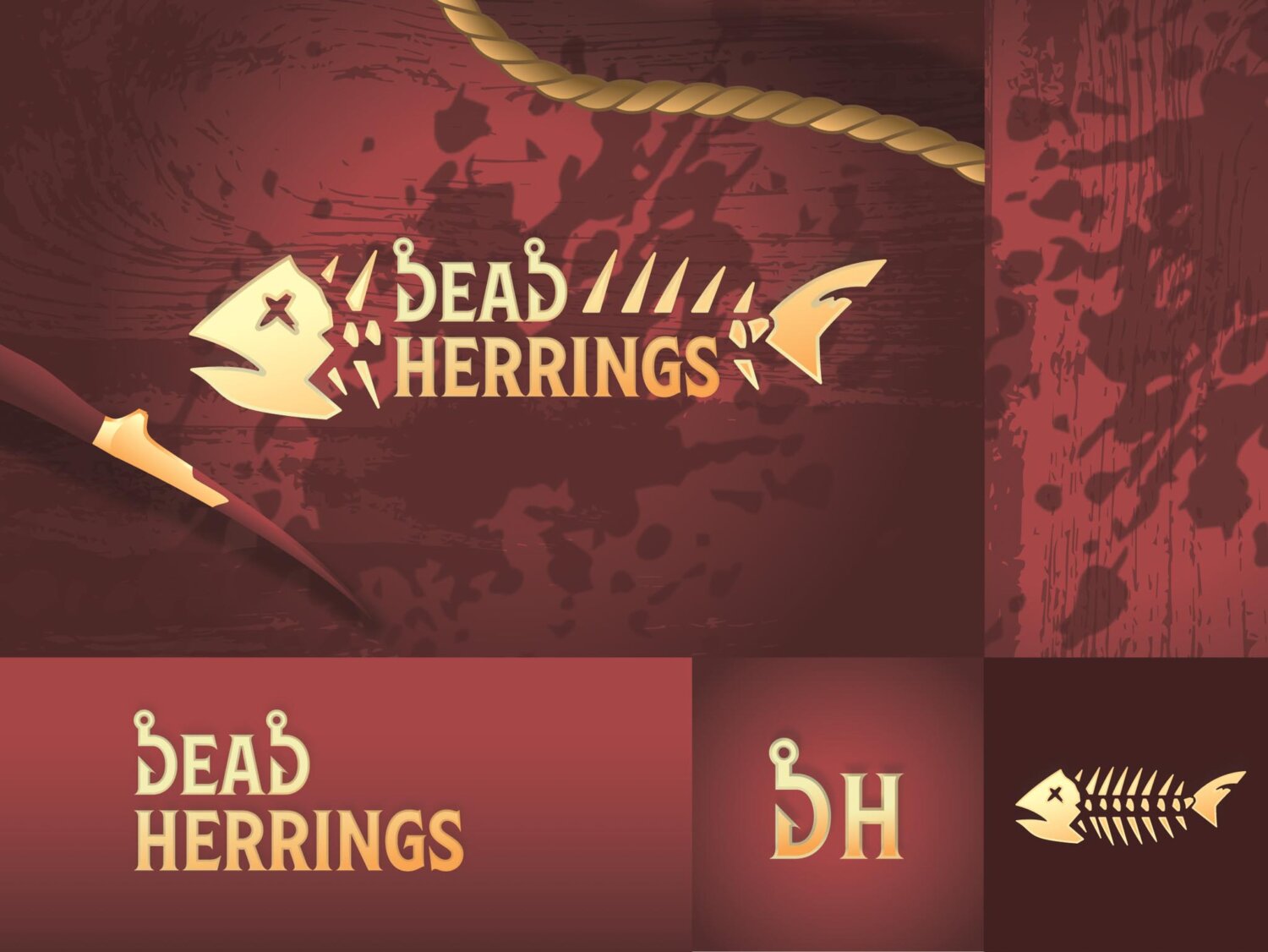
I chose the name “Dead Herrings” to allude to the logical fallacy/ literary device called a “Red Herring”, which is something that misleads or distracts from an important or relevant detail. I just changed “Red” to “Dead” and turned it into a very cool and ominous title. The name then gave me the iconography of a literal red herring’s skeleton.
The fish iconography led me to change the letter D in the word mark to be two sharp fishing hooks. I chose red because it’s in the phrase “red” herring and it alludes back to blood.
Add some more fishing iconography, a dark and mysterious setting, and a cast of colorful characters with dubious motives, and you’ve got yourself not only a great board game, but also a great story, which is what I wanted. A great story.


