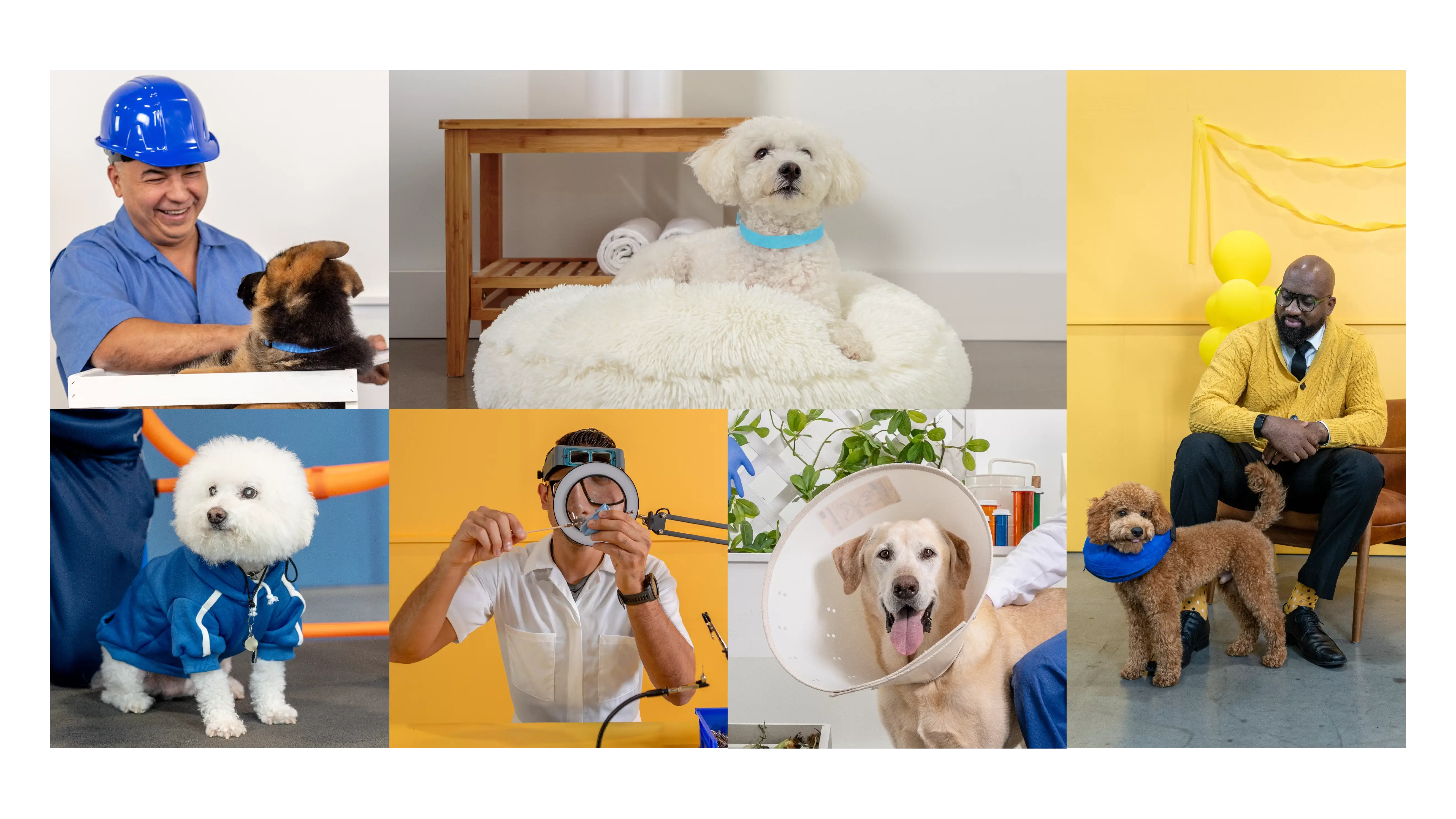
Better products
Better service
Better together
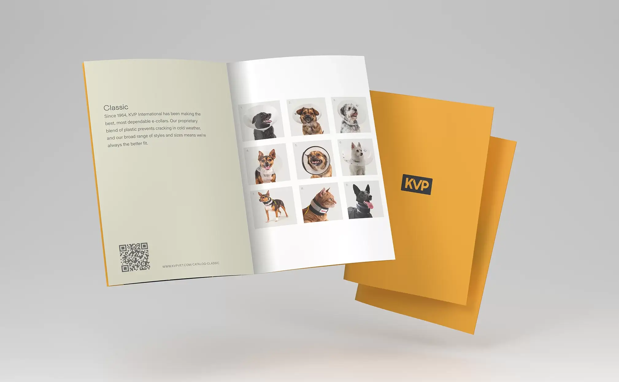
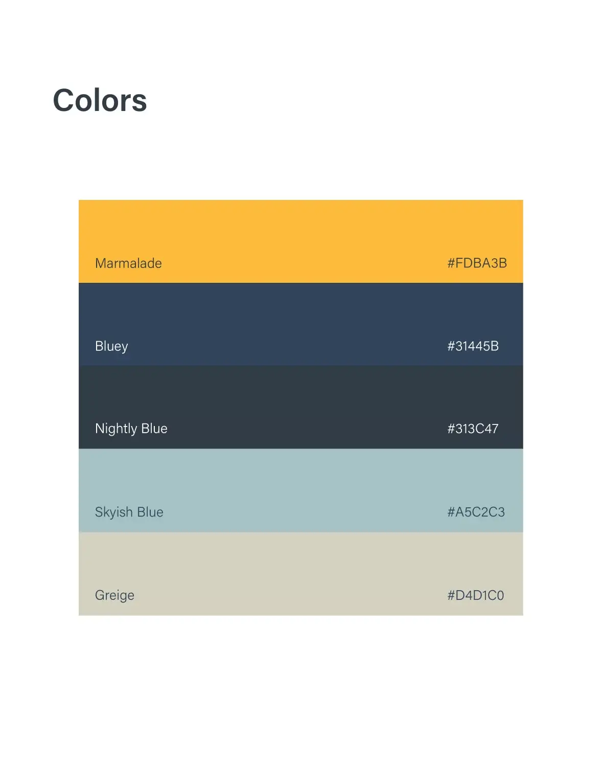
When I joined KVP International, my team and I were tasked with a complete corporate brand overhaul. While their previous branding was visually appealing, it lacked consistency. Their photography featured a mix of bright and pastel backgrounds, and their logo—a letter mark with a cat and dog silhouette—blended in with typical veterinary clinic designs. However, one thing was clear: both customers and employees had a deep passion for their work. The goal was to create a brand identity that truly reflected that love and dedication. They strive to communicate with authenticity, transparency, and respect in all interactions, whether it’s through their marketing materials, customer service, or employee communications. The tone of voice is conversational, friendly, and approachable, while still maintaining a professional demeanor.
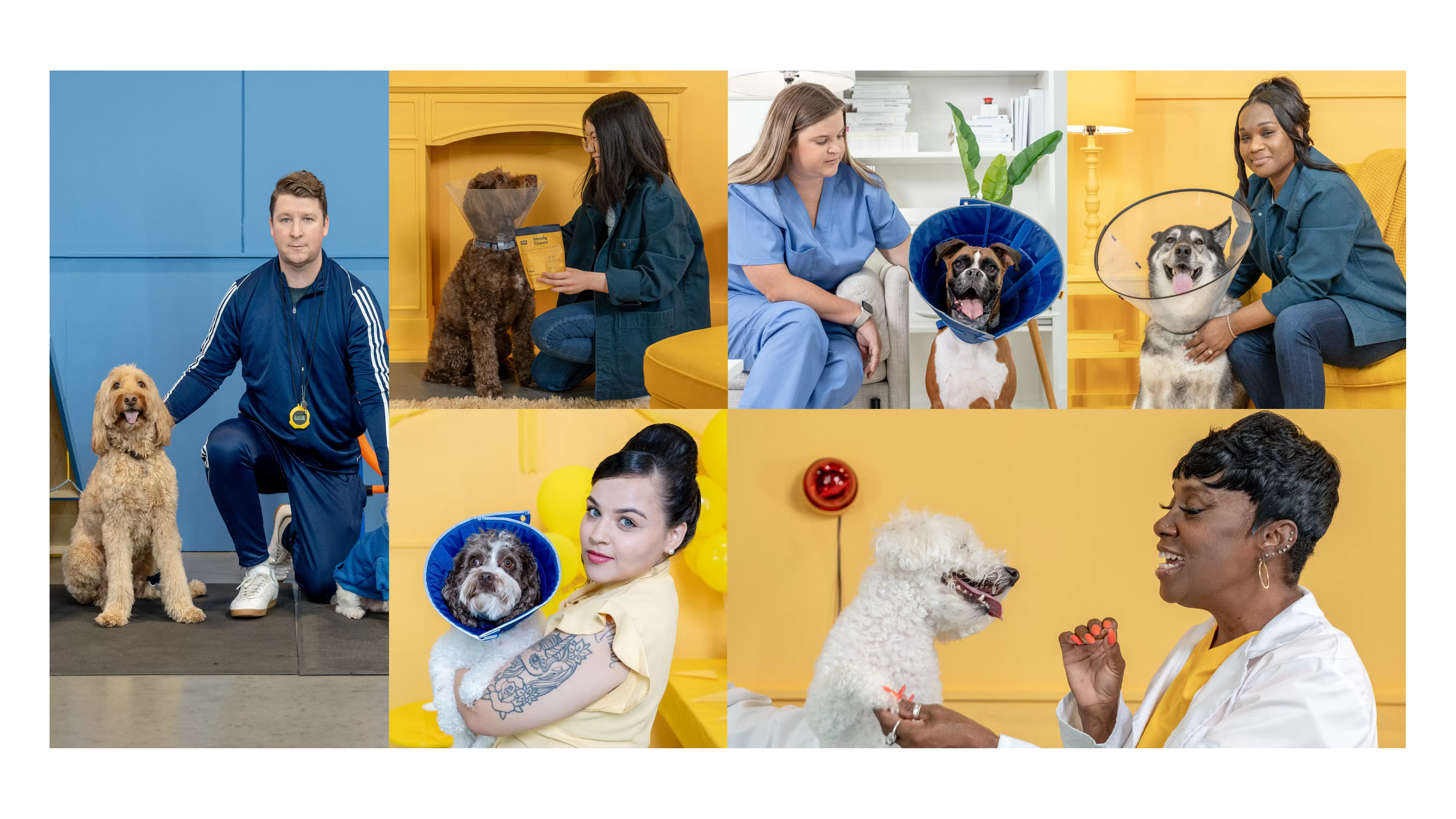

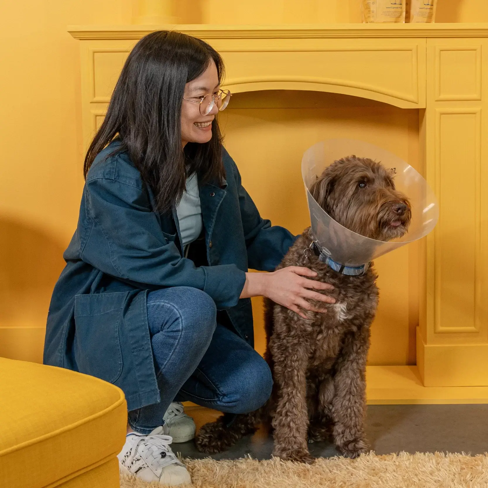
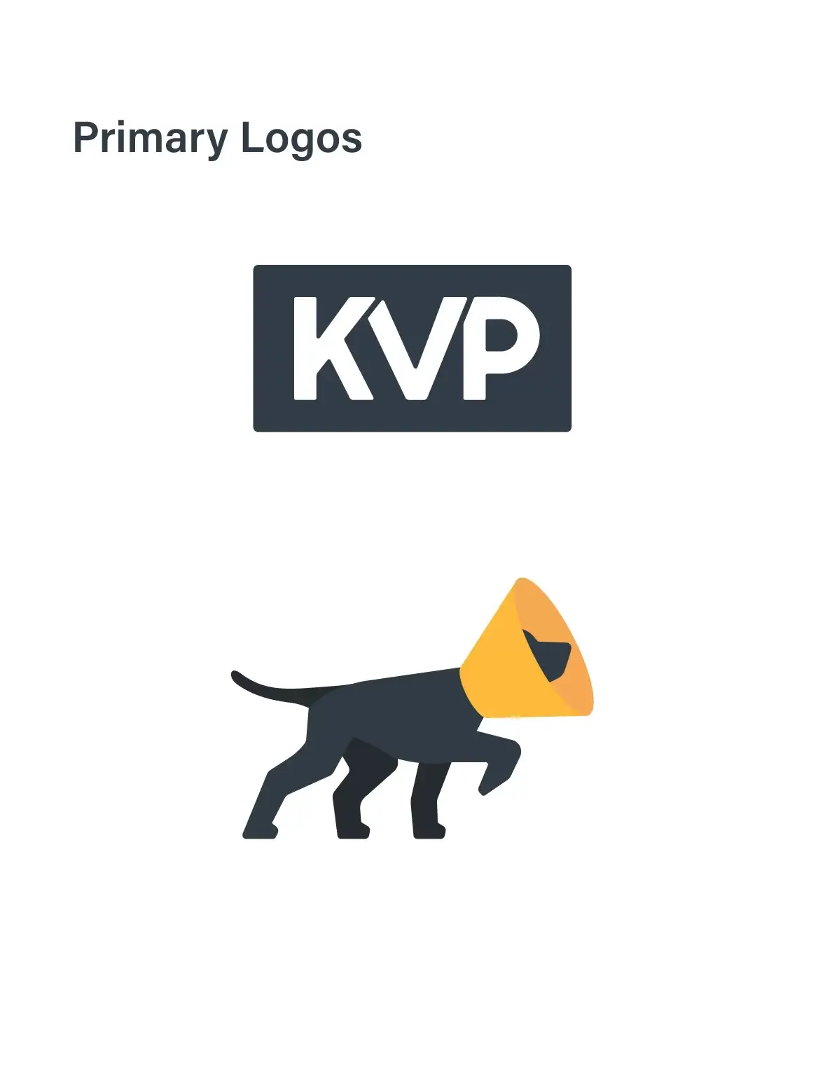
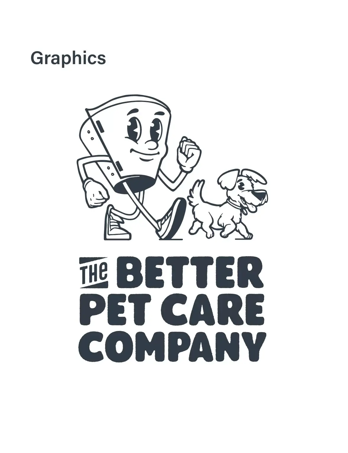
To build a cohesive, friendly, and professional brand identity, we focused on three key elements: a refined color palette, a clean and distinctive logo, and iconic imagery. We chose gold, or as we dubbed it “marmalade,” to represent our commitment to excellence in both product quality and service. To set KVP apart from typical veterinary industry branding, we simplified the logo, ensuring it felt unique while allowing our signature color to speak for the brand itself. Our illustrations and motion graphics also helped us stand out and lend a friendlier feel to our brand. These elements reinforced our identity while making our messaging more engaging and visually distinctive.
In addition to filming and editing footage from these scenes, I fully animated the KVP logo on the left. These would typically be used on social media and at the beginning of instructional videos.
